Company
MOODSAVINGS
Project Overview
Moodsavings is a fin-tech app looking to find their Product-Market fit in an overcrowded market.
To be successful, Moodsavings needed to improve their retention. In order to do this, they were betting on a feature that shows the connection between one's emotional health and financial health.
This case study shows the successful development of this core feature and successfully increasing user retention and user savings.
Roles
UI/UX Design
Operations
Product Management
Product Research
Usability Studies
Tech
Duration
Figma
Native Apps
iOS
Android OS
06 Month
Responsibilities
As Head of Design I was in charge of the product roadmap, overarching product strategy and management in addition to crafting the designs.
.png)
.png)
.png)

HYPOTHESIS
Emotions Affect One's Finances
Common knowledge tells us that a bad day can lead to bad eating habits (the WHOLE box of cookies?).
We think these emotions can also lead to bad spending habits.
GOAL
Show the Connection to Improve Retention
Show users the link between emotional wellbeing and financial well-being. And then use this to help users improve their emotional wellbeing by improving their financial well being and visa versa.
DISCOVERY PHASE
RESEARCH BEGINS
User Interviews & App Audit
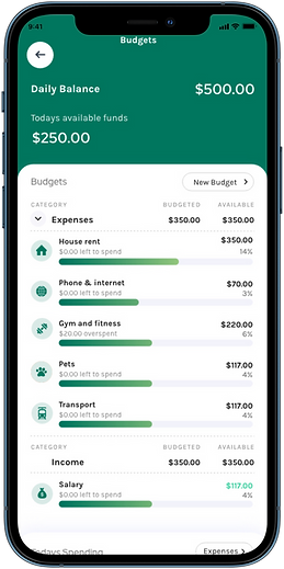
With most jobs I like to start with a full audit of a product. It helps identify low hanging fruit and allows me to make a mental model of the overall architecture and feature set. I found a number of problems with their auto save feature, budgets and onboarding. In addition to the feature below, I we updated a number of other features.
Interview
"I'm tired of being surprised. I think I have everything under control and then $2,000 for insurance appears"
— Jessica, 28yrs
Interview
"I wear a Fitbit and know all the stats about body, I want to know that about my bank account"
— Payam, 25yrs

USERS.
MEET BUSINESS NEEDS.
Investors were asking for specific things and we needed to figure out how to provide them, while hooking users.

Users Want
Business Need
DEFINE PHASE
WHERE WE'RE HEADING
A simple solution is needed to include both, users needs and numerous business demands.
.png)
THE PROBLEM
HOW DO YOU VISUALIZE THIS LINK?
The primary solution needed is a visualization that shows the connection between emotions, savings and gives insights.
DESIGN PHASE
VISUALLY CONNECT EMOTIONS TO FINANCES
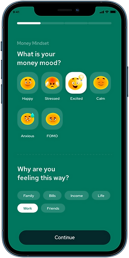
My goal is to design an interactive visualization of the connection between one's emotions and finances.
Open App
Track your emotion
Show Results
A visualization users can learn from
Enter App
Homepage
.png)
.png)
.png)
PATTERNS WILL HELP
Show me the Future So I'm Not Surprised
When you expect something, it's less likely to cause stress or a negative emotion. If your actions have patterns, then we can start to predict these and show you insights about yourself. I take a look at how would we could show a user that an expense is coming in the future, and also show them repeating emotional and financial patterns.
Future Classes
Future Bills
Future Hormone Cycle

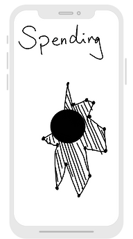
RAPID SKETCH EXPLORATION
Pen and Paper + Lots of Sketches = Better Designs
01.
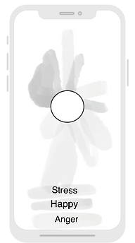
Design Intent
Start by showing the month in a circle. Daily emotions can be shown as a slice of the circle.
04.
Design Intent
That line is very vague, let's make it darker and fill in the volume underneath.
02.
Design Intent
Contrast emotion against spending.
05.

Design Intent
The black blob is also very vague, what if we make the spending a specific line? And put the emotion on top?
User Feedback
I want more specific information, this is too vague.
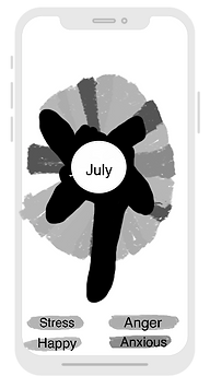
07.
Design Intent
I want to break away from the lines, try something different and have the background color be the emotion and go all the way to the edge of the screen. The spending could be opaque and close to the middle of the circle.
Let's move the month name to the top left so we open up space to put a new label in the circle.
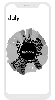
08.
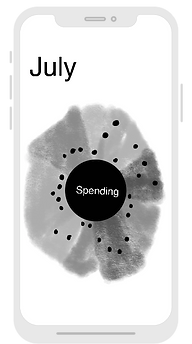
Design Intent
Let's label the circle as spending.
I want to be really specific with each day of spending. I'll make it a dot.
03.
Design Intent
Show daily spending ups and down with a line. Place it on top of emotions to show the connection.
06.
Design Intent
Let's try to make it more clear by making each emotion and day of spending one-in-the same.
Problem - we don't know the scale of the person's emotion so can't do this.
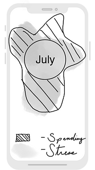
09.
Design Intent
The dot is hard to see, what if I filled in the space below, does this make it easier to see the spending pattern?
10.
Design Intent
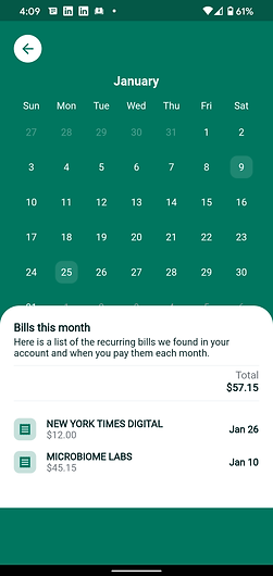
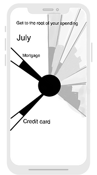
We can show future spending, it's always scary when your credit card bill is pulled out. What day is that again? Let's show the date here to help the user expect it and stay calm when their bank account drops.
11.
Design Intent
That spiky look is a little ugly, what if we connected the dots together, that will make it easier to show spending trends.
12.
Design Intent
Overlay the spending trends on top of the daily emotions. I like this!
VALIDATE PHASE
START USER TESTING
I chose the circle design because it gives you a snapshot of the month. Unexpected charges spike stress and adrenalin, if a user can see upcoming charges that reoccur on a monthly cycle it should reduce stress.
Round 01 Design Update
Results
Stress Selected

User Feedback For Round 01
Results


"I think these are buttons?"
"Yes! I spend so much money here"
Good to see a
big cost coming
Not really sure what to do when I land here
"Want to see more info instantly"
Stress Selected


Want more connection between emotions and $$$
What day is connected to what?
Is this a stressed
day or not?


Really like seeing stressed $$$ Total. Can you tell me more?
Round 02 Design Update
Results

Happy Selected

User Feedback For 02
Results
"The emotions are helpful to see together"
App does the math automatically

"I like the color coding to the graph"
Spending turned into a line to show spending patterns


Showing all emotions at once for immediate stimulus

Happy Selected
"I want to see the emotion and day more clearly"
Amount appears after an emotion is tapped
"Can the day and the emotion be one? Still hard to read"
"I like this, but can you tell me more?"
Numbers added for easier connection to date


More calculated info added


"Can I see these totals on the landing page too?"
"I want to see the results first, not the buttons"
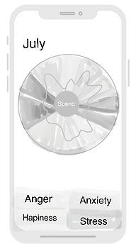
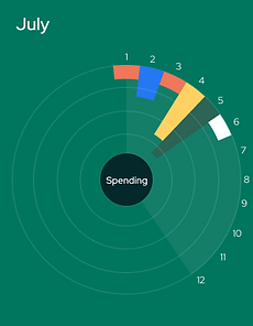
Round 03 Design Update
Circle Graph Exploration


User Feedback For 03
Circle Graph Comments
Design uses concise shape to show amount of spending
"It makes more sense to me to have the size show the amount spent"
Emotion and spend is one in the same and grows from the center
"It's not clear to me that I can tap to see exact daily $$$"
Design exploration
"It makes more sense to me to come from the middle"
Tappable circles added to encourage discovery
"This looks much better, this is clear but circles are too too big."

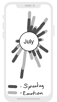
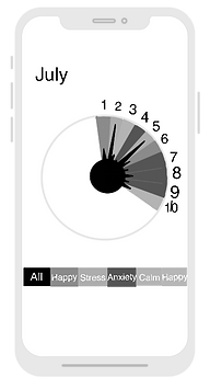
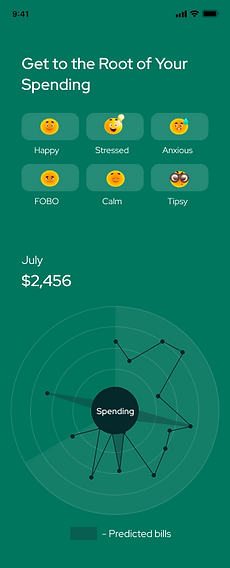
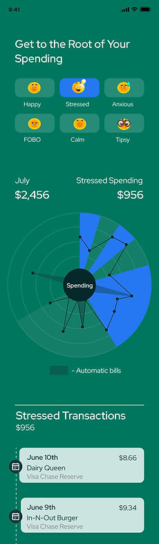
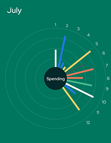
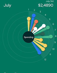
Round 04 Design Update
All Emotions
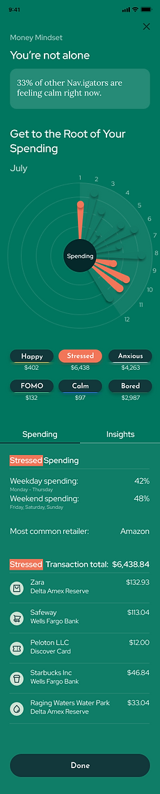
"Stressed" Selected
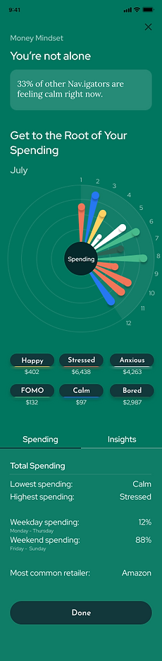

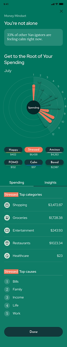

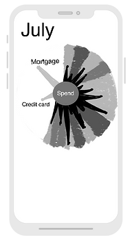
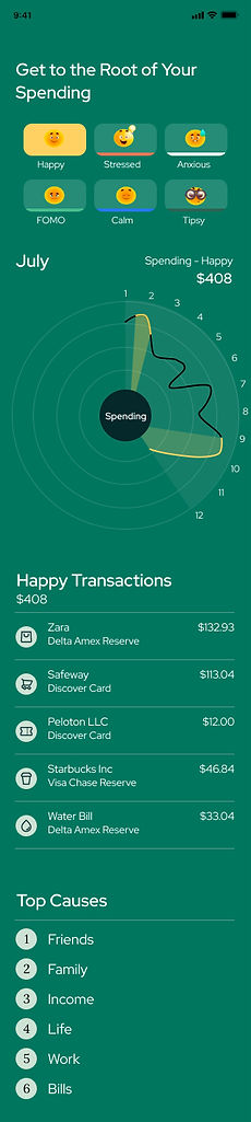
Final Designs
Emotions + Spending Interactive
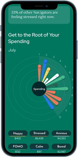.png)
.png)
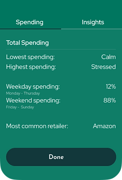
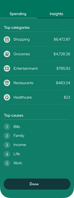
Emotions +
Spending Insights
.png)
.png)
.png)
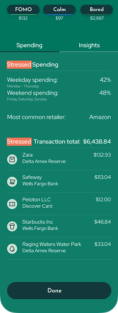
Stressed +
Spending Interactive
.png)
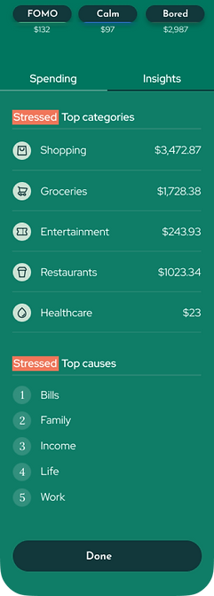
Stressed +
Spending Insights
.png)
.png)
RESULTS
OUTCOME
Retention
+2.3%
Savings Trend

Daily Active Users Trend

IMPROVE YOUR HEALTH & SAVINGS
.png)